Skip to content
Free Font Designers
Home
Browse Fonts
Staff Picks
Designers
License
Contact
Blog
Submit Fonts

Categories

Fancy

Cartoon

Comic

Groovy

Old School

Curly

Western

Eroded

Distorted

Destroy

Horror

Fire, Ice

Decorative

Typewriter

Stencil, Army

Retro

Initials

Grid

Various

Foreign look

Chinese, Jpn

Arabic

Mexican

Roman, Greek

Russian

Various

Techno

Square

LCD

Sci-fi

Various

Bitmap

Pixel, Bitmap

Gothic

Medieval

Modern

Celtic

Initials

Various

Basic

Sans serif

Serif

Fixed width

Various

Script

Calligraphy

School

Handwritten

Brush

Trash

Graffiti

Old School

Various

Dingbats

Alien

Animals

Asian

Ancient

Runes, Elvish

Esoteric

Fantastic

Horror

Games

Shapes

Bar Code

Nature

Sport

Heads

Kids

TV, Movie

Logos

Sexy

Army

Music

Various

Holiday

Valentine

Easter

Halloween

Christmas

Various

Font Category

Fancy

Foreign look

Techno

Bitmap

Gothic

Basic

Script

Dingbats

Holiday

Resources

  • Contact
  • License
  • Designers
  • Blog
  • Privacy Policy
 

Subscribe and
Stay in the Loop

Be first to know about new font releases, staff picks, font trends, and more.

© 2026 freefontdesigners.com. All rights reserved.

Minikin

7.499 Download

By Graham Herrli

100% freeDonate to author

Typeface

Start Creation

The quick brown fox jumps over the lazy dog.

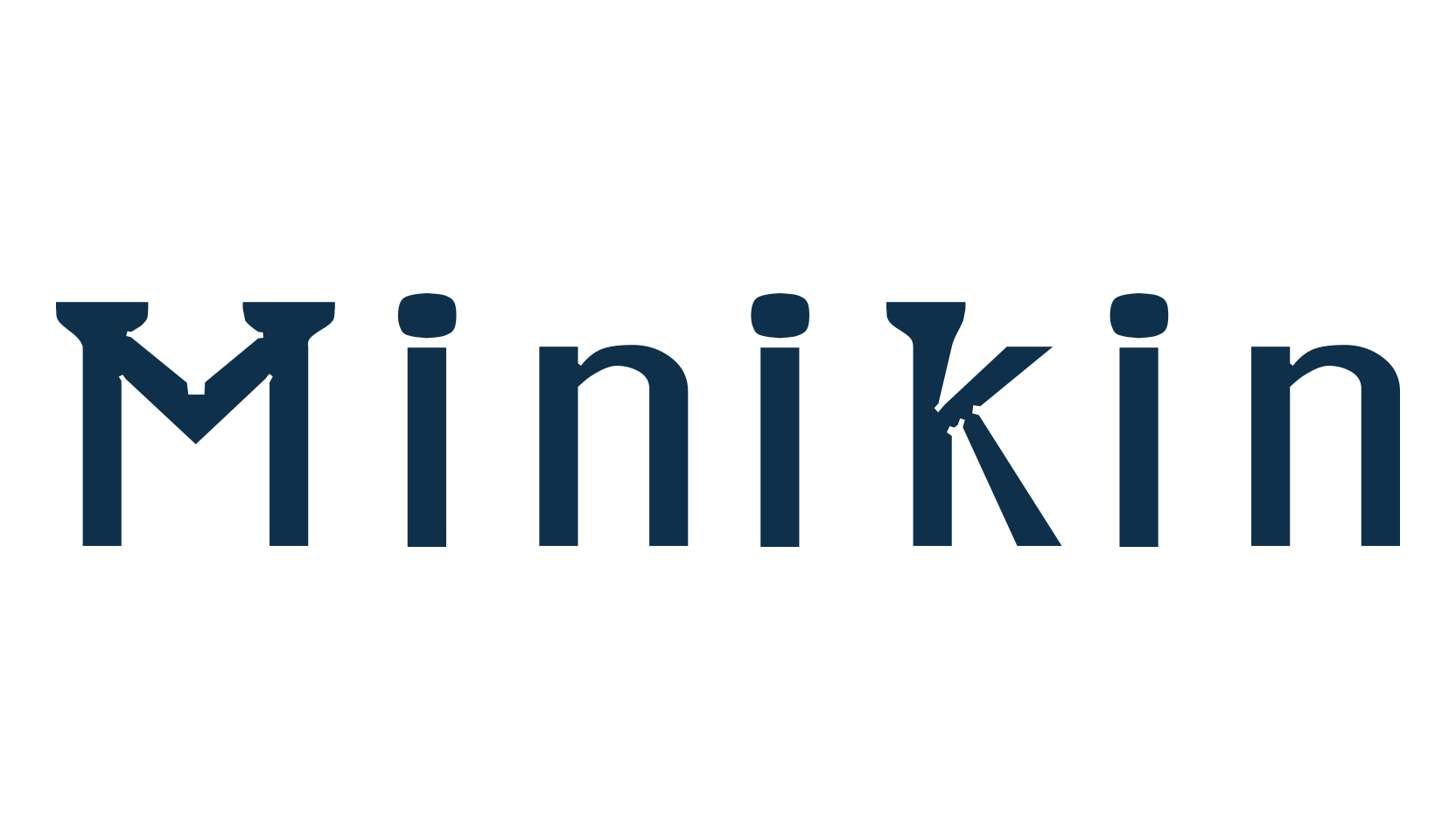
Minikin is a caption font, made for display at extremely small sizes.

I call it a semi-serif font because it only has serifs on ascenders and descenders. By making the ascenders and descenders so wide, I was able to shrink their height. It’s fairly common for descenders to take up about 20% of a font’s height. In Minikin, the descenders only take up 15% of the height. The ascenders are also compressed to take only 15% (measuring between x-height and cap-height). A few characters—(,|, {,},l, and)— extend beyond the cap-height by a further 3%. This leaves a full 67% of the height for main body of most letters. Some other things that make it legible at small sizes are:

(1) It has low stroke contrast. The thickest strokes are about 13% of the height. The thinnest are about 8%.

(2) It has thick strokes, which prevents it from looking washed-out at small sizes. (At larger sizes, its thick strokes and vertical emphasis make it look a bit like a blackletter.)

(3) Its counters are very open. Rather than anchoring curves with one point, I often anchored them with two, making the circular areas bulge toward becoming rectangles.

(4) Where whitespace points in toward the letter, a little additional whitespace has been hollowed out to prevent that corner from filling with ink when printed. For an example of these hollows, view the ampersand around size 72.

(5) The letters are spaced generously: usually each of the bearings (the margins on each letter’s edges) is about as wide as a stroke, which means that the space between each letter pair is almost two strokes wide.

You can use this font under a Creative Commons Attribution 2.0 Generic license (creativecommons.org).

If you do use it, please send an email to herrli ch [at] hotmail com to let me know. (No obligation to email, but it'll give me a warm fuzzy feeling if you do.) I also welcome donations using dafont.com's donate link.
  • File Type

    ZIP, TTF, WOFF2

  • File Size

    23.00 KB

  • Released Date

    October 17, 2026

License

100% free

Styles

1

Categories

VariousBasic

Tags

public-domainaccentsMinikincommercial-usepersonal-use

Review

Minikin, various font preview

Minikin

Share
GH
Graham HerrliDetail Author

Graham Herrli

BANNERADSBANNERADSBANNERADS

  • Bebas Neue
  • Caviar Dreams
  • Harry P
  • Lobster
  • Avengeance Heroic Avenger
  • Gobold
  • Walkway
  • Loki Cola
  • Bebas Neue
  • Caviar Dreams
  • Harry P
  • Lobster
  • Avengeance Heroic Avenger
  • Gobold
  • Walkway
  • Loki Cola
  • Bebas Neue
  • Caviar Dreams
  • Harry P
  • Lobster
  • Avengeance Heroic Avenger
  • Gobold
  • Walkway
  • Loki Cola
  • Bebas Neue
  • Caviar Dreams
  • Harry P
  • Lobster
  • Avengeance Heroic Avenger
  • Gobold
  • Walkway
  • Loki Cola
  • Lemon Milk
  • Bebas
  • Vogue
  • Geo Sans Light
  • Hug Me Tight
  • Optimus Princeps
  • Sketch Block
  • Steelfish
  • Lemon Milk
  • Bebas
  • Vogue
  • Geo Sans Light
  • Hug Me Tight
  • Optimus Princeps
  • Sketch Block
  • Steelfish
  • Lemon Milk
  • Bebas
  • Vogue
  • Geo Sans Light
  • Hug Me Tight
  • Optimus Princeps
  • Sketch Block
  • Steelfish
  • Lemon Milk
  • Bebas
  • Vogue
  • Geo Sans Light
  • Hug Me Tight
  • Optimus Princeps
  • Sketch Block
  • Steelfish
  • Coolvetica
  • Roboto
  • Big Noodle Titling
  • The Bold Font
  • Harabara Mais
  • Code
  • KG Red Hands
  • Heavitas
  • Coolvetica
  • Roboto
  • Big Noodle Titling
  • The Bold Font
  • Harabara Mais
  • Code
  • KG Red Hands
  • Heavitas
  • Coolvetica
  • Roboto
  • Big Noodle Titling
  • The Bold Font
  • Harabara Mais
  • Code
  • KG Red Hands
  • Heavitas
  • Coolvetica
  • Roboto
  • Big Noodle Titling
  • The Bold Font
  • Harabara Mais
  • Code
  • KG Red Hands
  • Heavitas
  • Waltograph
  • Champagne & Limousines
  • Cocogoose
  • Akira Expanded
  • Comfortaa
  • Keep Calm
  • Pricedown
  • Walter
  • Waltograph
  • Champagne & Limousines
  • Cocogoose
  • Akira Expanded
  • Comfortaa
  • Keep Calm
  • Pricedown
  • Walter
  • Waltograph
  • Champagne & Limousines
  • Cocogoose
  • Akira Expanded
  • Comfortaa
  • Keep Calm
  • Pricedown
  • Walter
  • Waltograph
  • Champagne & Limousines
  • Cocogoose
  • Akira Expanded
  • Comfortaa
  • Keep Calm
  • Pricedown
  • Walter